
I want to show how easy it is to create dashboards with Oracle Analytic Cloud Data Visualization and with Essbase Cloud as data source.
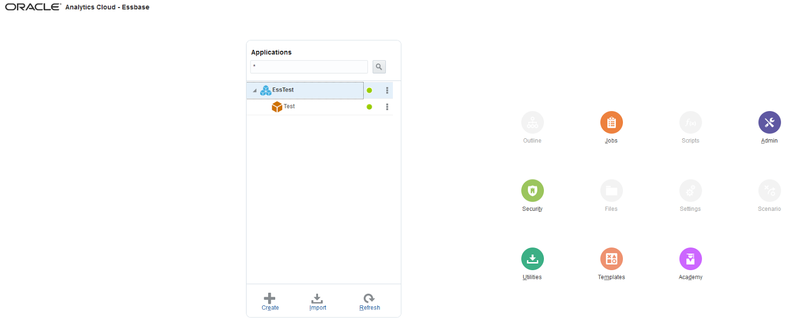
First I will create a new Essbase application from the scratch (manually).

My skeleton application
And now I'll create a very simple outline so I can load some data in the cube.

It's very easy to do this (almost as easy as the old days), simply click on "Lock and Edit" and start creating Dimensions/Members. So here is my application's outline.

I created five dimensions (Account, Scenario, Years, Version, and Country) with one or two members in each.
Now I'll connect to the cube from SmartView (Essbase Cloud connection).
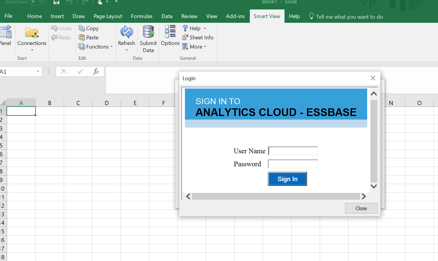
Select the application and database (just like connecting to on-premise Essbase application)

Locking/Sending some data.

Now I have created a simple application with some data, I want to see how easy it is to use Data Visualization and access my Essbase cube. This is the OAC landing page.

Before I start working on the report I want to create my data source (it's similar to Tableau but in my humble opinion a lot easier to work with and more intuitive). So I'll start by clicking on Data Sources.

And create New EssCS Data Source.

And select the Essbase application and database you want to connect to.

And the connection is now ready and accessible via the Databases tab.

Now we have the connection ready, let's create the report. From the newly created Database connection, I'll create a new project. (Create Project will create Data Visualization report and Create Analysis will create Oracle BI Answers report).

Creating new Project will land you in Data Visualization.
Creating new Analysis will land you in Oracle BI Answers.

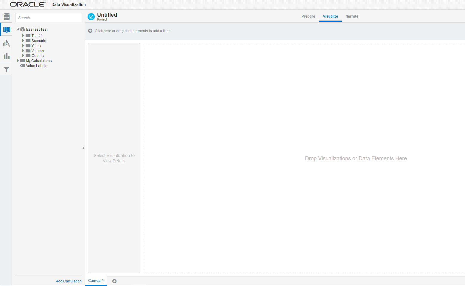
Back to Data Visualization, on the left side you can see the Essbase model and it's ready to be used in the report. Yeah it's so easy!.
So here is my Essbase model, you can see the two measures (Account members) I created.

What if you want to add calculated measures? Well it is very easy, right click on "My Calculations" and Add Calculation.

I want to calculate Expense because it's no available in my model, I will simply drag/drop Total Revenue. drag/drop the minus operator, and drag/drop Net Profit


After saving the calculation it will show up in the model and that's it.

You can start building your report by selecting the measures you want to report on, the dimensions, and the filters you want to apply by simple drag and drop movements. You can create multiple canvases, add narrative data, change the visualization type (Bar, Pie,.....). So here is the data I entered in SmartView in tabular format.

Here are my measures.

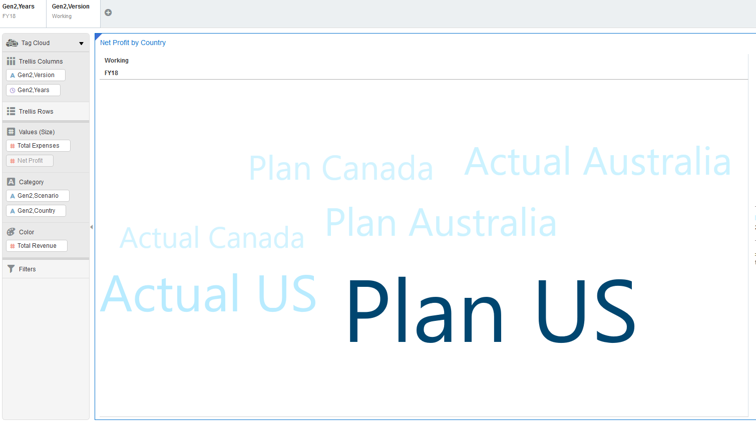
I can color-highlight the best performing country for any measure by placing the measure in "Color" section, so here I want to highlight the country with the best Net profit margins.

Or I can change the font size of the country with the biggest Expenses.

You can easily change the visualization of the data in one click.

For example "Tag Cloud" visualization.
"Pie" visualization.

Want more colors? Piece of cake.

So you can put together the data you want and visualize anyway you want, add narrative data, and present it in a nice way.

My conclusion? Data Visualization is an awesome and super powerful tool, very easy to use and extremely smooth. You don't need to be a technical guru to build a fancy dashboard. And bear in mind I only showed a very simple report for the sake of simplicity, in reality you can do a lot more...and the best part? You don't need to code anything.
Nice post .Keep updating
ReplyDeleteCognos TM1 online Course Bangalore
It is nice blog Thank you provide important information and I am searching for the same information
ReplyDeleteTableau Online Training
Thank you for this great collection! If you are looking for data visualization tool with various big data analytics solutions then Syntelli Solution is one of the best option for you.feel free to visit our website.
ReplyDeleteA great information about data visualization tool. Simply you have elabourated about the tools in a great manner.Thanks for sharing information with us.
ReplyDeleteGreat post, thank you for sharing this usefull information.It is very easy to understand.Keep regular update with your blogs.
ReplyDeleteCrm Software Companies in Bangalore | Crm Software Development Company Bangalore
Great post.Thank you for sharing this post.
ReplyDeleteKeep updating more blogs.
big data course
big data and hadoop course
Education must continue. Many forms of e-learning (such as online courses with authentic tasks and computer-supported collaborative learning) have become essential in distance education. A descriptive survey was conducted on 125 college students to explore college students’ profile and perception of distance education in the new normal. The study revealed that most of the respondents were 18-20 years old, 1st-year college, engineering and technology, and General Santos City. Respondents answered open schedule-asynchronous as the top option for the type of distance learning they want to enroll. They will be using smartphones as their device, accessing internet connection at home through prepaid plans. Respondents expect online enrolment as student support service under distance learning mode, time and money saved to commute and live away from home as the benefit of distance education and would like to enroll in the distance learning program. The majority of the respondents believed that traditional and conventional class is essential. They have a problem with the supply of electricity, internet connection, and financial and teacher-related problems.
ReplyDelete